#How to read in a .sav file using the library haven
df2<-read_sav("~/Desktop/Lizz/Spring19/CSCI498/May10Economy/Economy/economy.sav")

#in
#how to look up the names of certain variables
df3<- df2[, c(24,168,169,170,171,191,203,201)]
cleaning the dataset
#Changing "race" variable to bi variable "1" for white, "0" not white
df3$bi_var <- ifelse(df3$racecmb == 1, 1, 0)

#how to change a contiouse variable to a factor varibale
df3$income<-as.factor(df3$income)

#how to label the levels of a factor variable
levels(df3$income)<-c("<10","10-20","20-30","30-40","40-50","50-75","75-100","100-150",">150", "NA")

#cleaning the sex varaiable
df3$sex<- as.factor(df3$sex)
levels(df3$sex)<- c("Male", "Female")


#cleaning race
df3$race1_1 <- as.factor(df3$race1_1)
levels(df3$race1_1) <- c("White", "Black", "Asian", "Other", "NA")
Cleaning data: changed “income”, “racecmb”, “sex” variables from an integer to a factor. Then labeled the factors based off codebook to create a graph that describes the data accurately.
Created a new bivariate variable from the race variable where 1 represented “white” and 0 represented “other”.
Univariate analysis
ggplot(df3, aes(x=income))+geom_bar(fill="darkorchid1")+xlab("Income per thousand")+geom_text(stat = 'count', aes(label =..count..), vjust=-.2)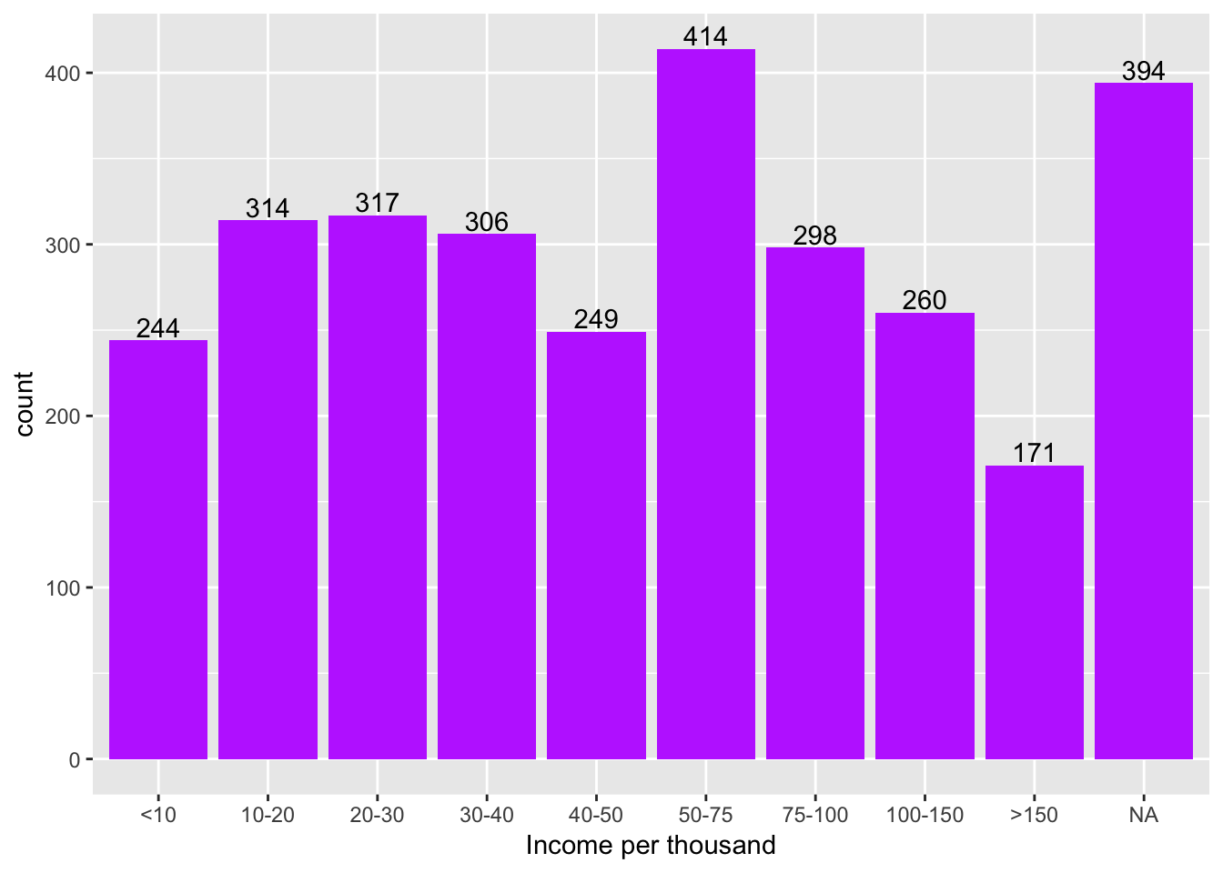 This bar chart represents the amount of people that answered the question about the level of income per year that they earn in thousands of dollars. The last bar “NA” represents the number of people that declined to answer the question.
From the 2,967 people in the survey about 400 denied to answer the question. The highest count was for people earning between $50,000 and $70,000 dollars a year. The lowest count was the bar that respresents the people earning over $150,000 dollars a year with a count of about 175.
ggplot(df3, aes(x=income))+geom_bar(aes(y=..count../sum(..count..)),fill="deeppink4")+xlab("Income per thousand")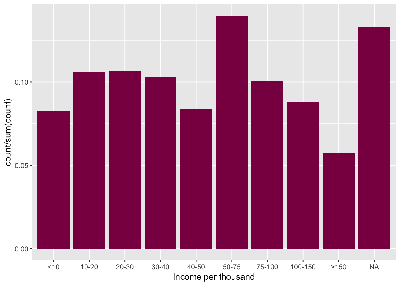
This bar chart represents the percentages of people in each category of income in thousands of dollars per year. The last bar “NA” represents the percentage of people that declined to answer the question. We can see that more than 13% of people participating (2,967) in the survey decided not to answer.
The highest percentage of people were those earning between $50,000 and $70,000 dollars a year. The lowest percentage was the bar that respresents the people earning over $150,000 dollars a year with a percentage less than 6%.
Bivariate analysis
ggplot(df3, aes(x= income, fill=sex))+geom_bar(position = position_dodge())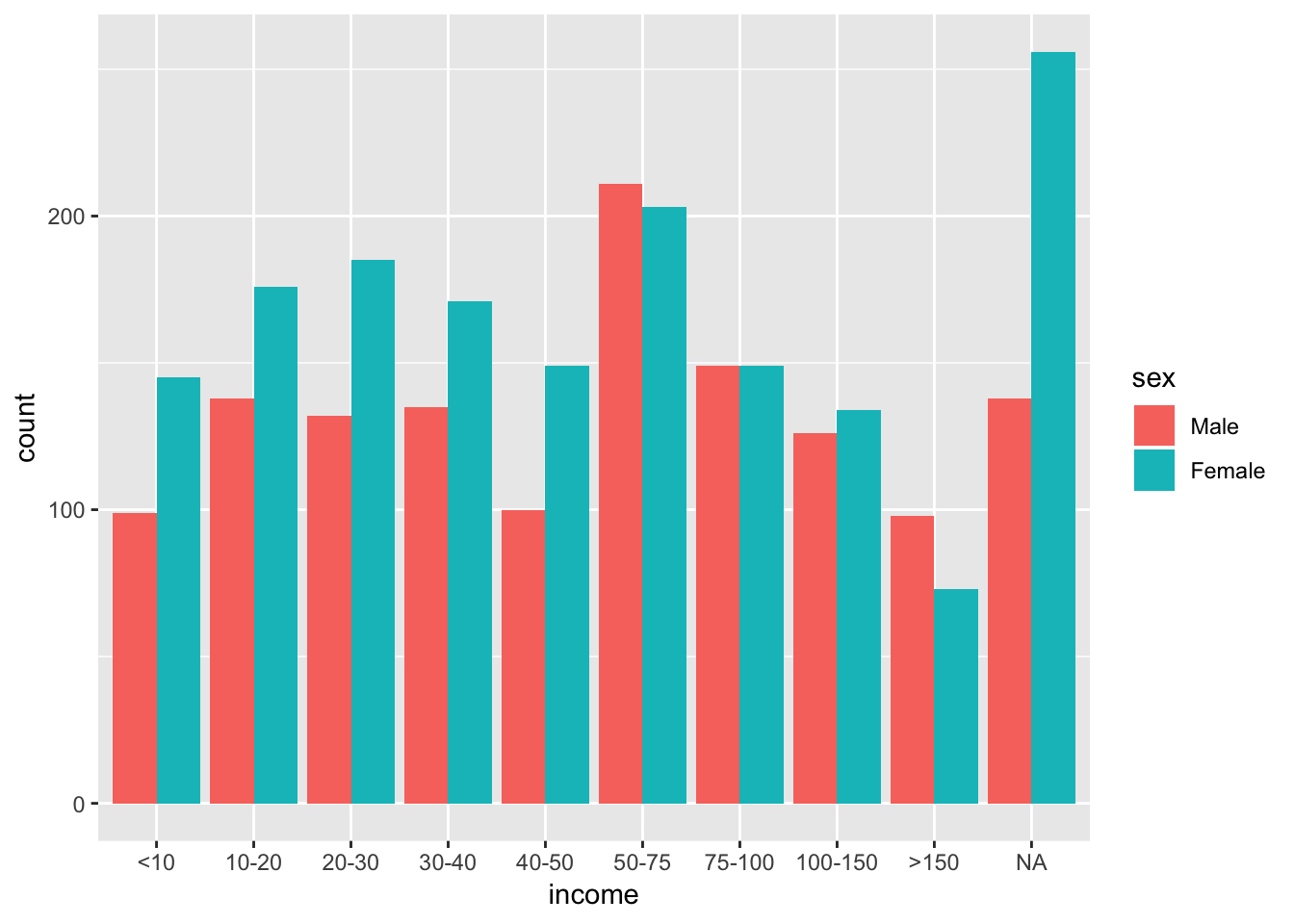
This is a bar graph that show us the amount of people by sex (female and male) per category of the level of income. There were more than 250 females that decided not to answer the question compared to about 150 male participants.
The highest count for both male and female was under the $50 to $75 thousand bracket which according to the CNBC website aligns with the mean salary in US is about $56 thousand a year (https://www.cnbc.com/2017/08/24/how-much-americans-earn-at-every-age.html). The lowest count was in the over $150 thousand per year with about 100 count for male compared to about only 75 for female.